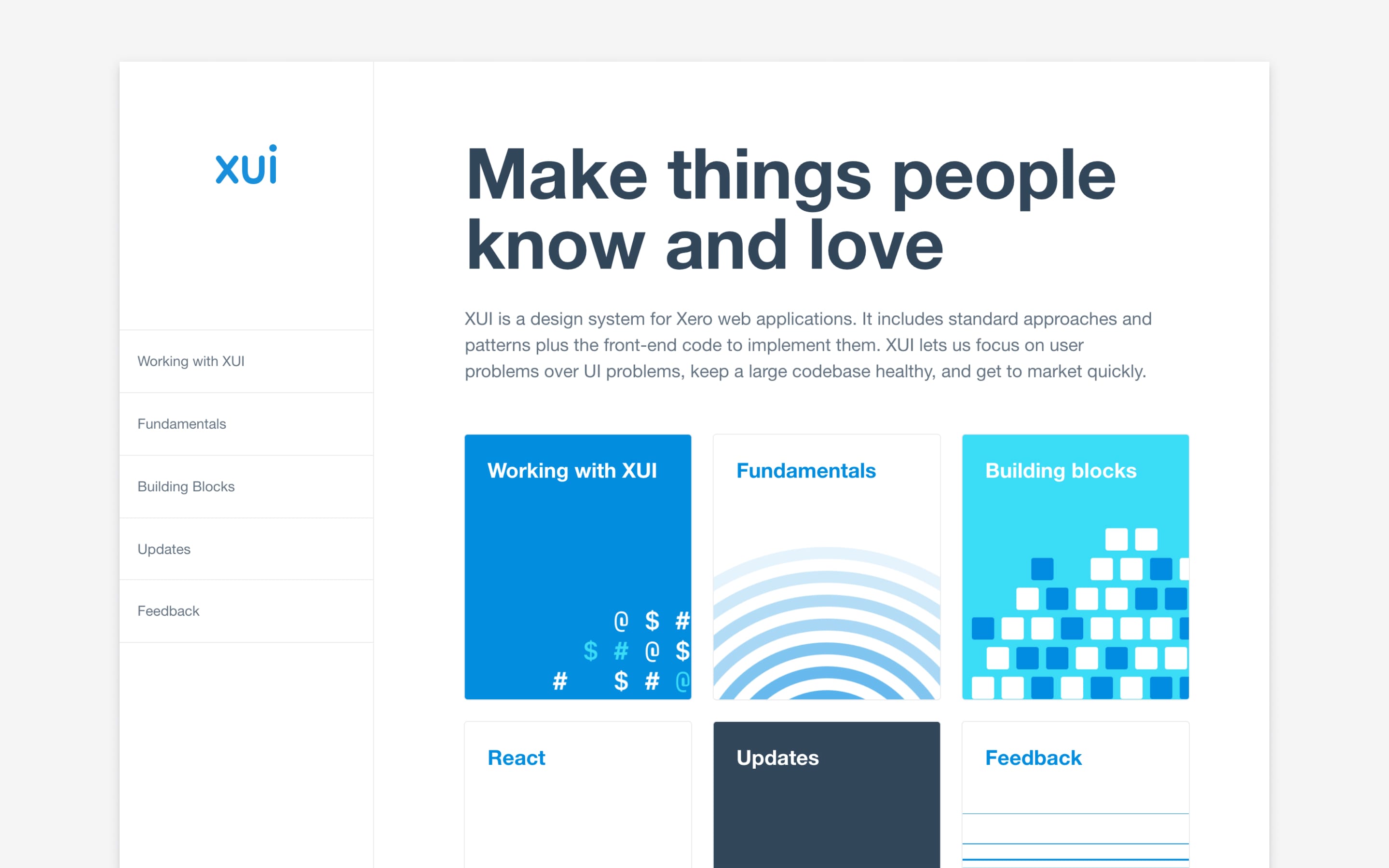
Xero’s high-dependency design system
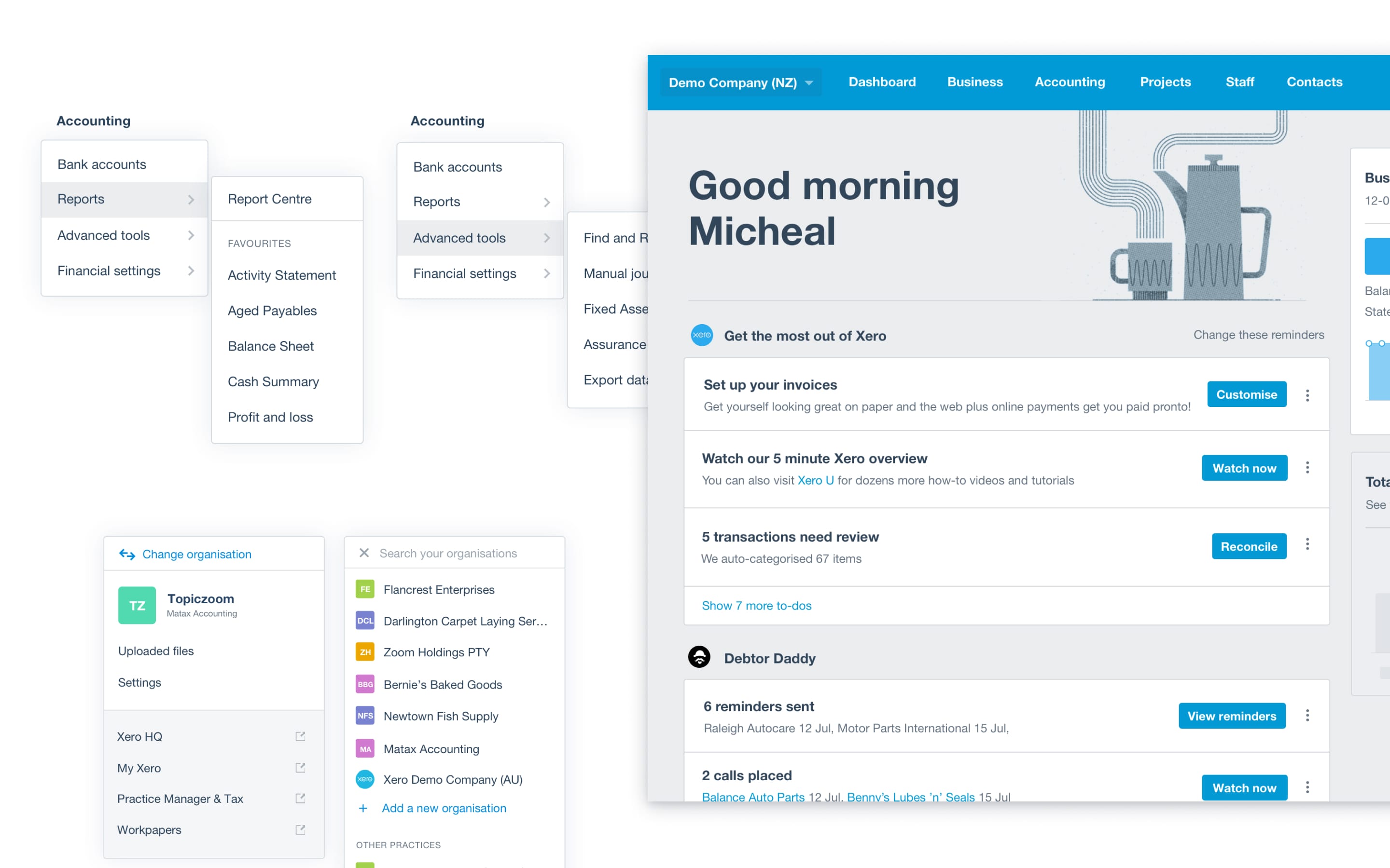
Xero, 2016–18Over the 8 years before I joined, Xero’s interfaces had grown fairly organically. There were almost endless variations of common elements like buttons or dropdowns, and common functions like searching or filtering. Both users and speed-to-market were suffering — I joined in 2016 to work on this problem.
With a small cross-functional team, we built a toolset now relied upon by dozens of designers and hundreds of engineers. My time was spent diversely – down in the weeds of tiny interaction design decisions, advocating and encouraging adoption across the business, helping designers to effectively solve interface problems, and learning where the system needed to go next.
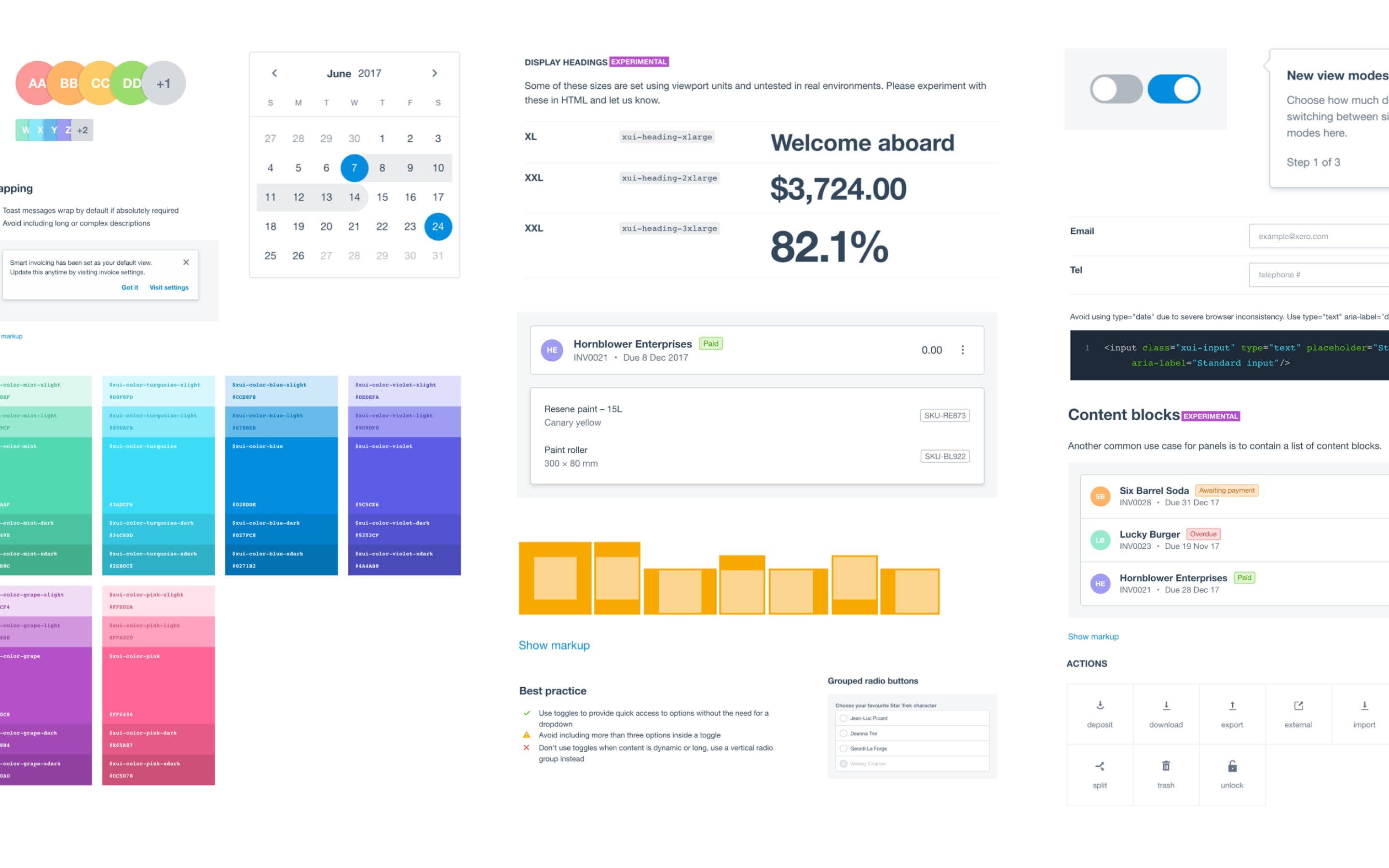
A big part of my role involved pairing with product designers across Xero to implement the outcomes they needed. This was very useful to both drive initial uptake and understand where the system's gaps lay.
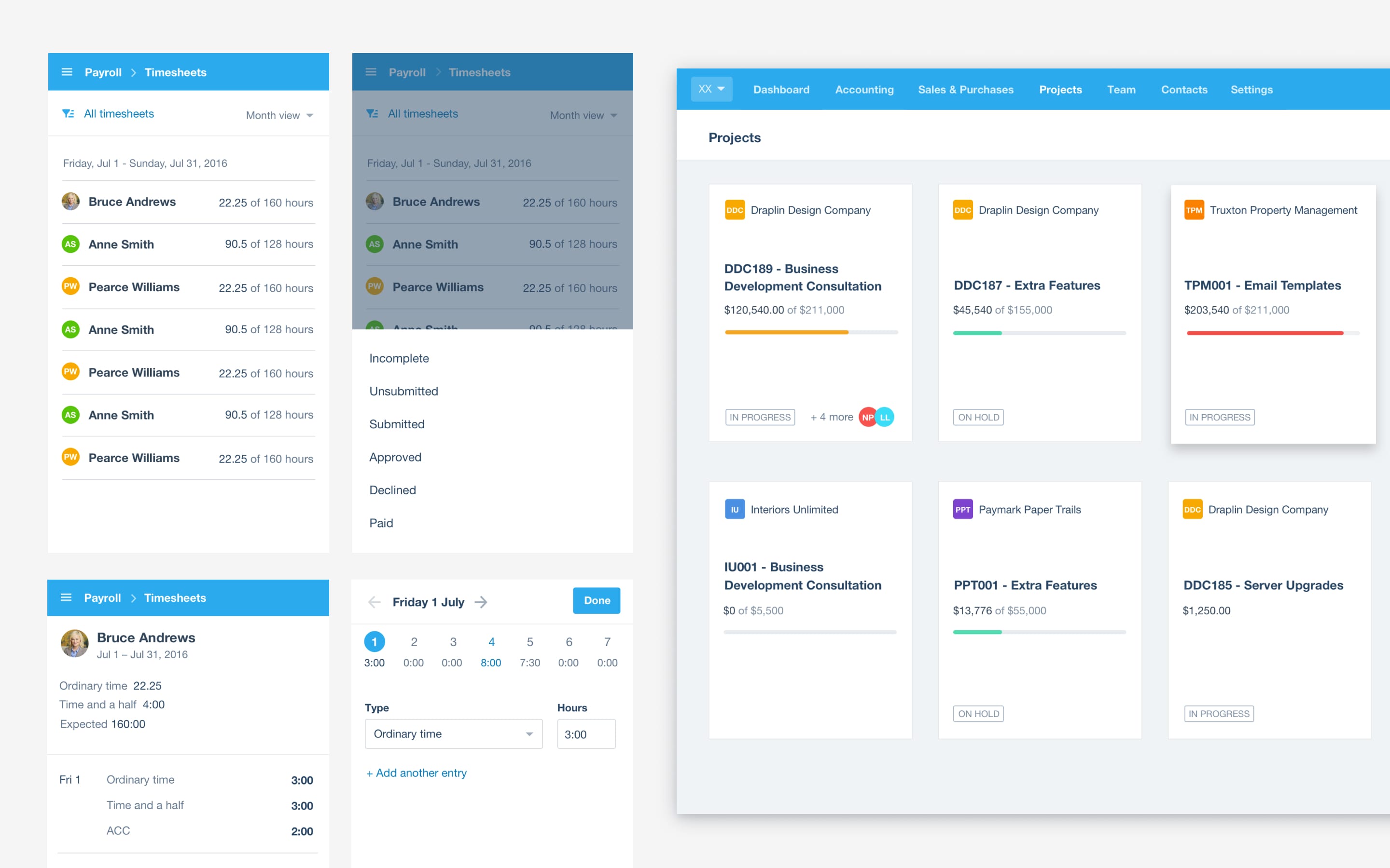
Two big areas we addressed with this feedback were the need to provide options for denser accountant-focused interfaces and the addition of higher-level components to avoid teams needing to reinvent complex interaction details for things like filtering lists of records.